Irish Wildlife Trust
Duration
Jul-Aug, 2025
Client
Irish Wildlife Trust
A UX/UI redesign exploring how IWT could make its content easier to navigate and its different ways of getting involved easier to understand.

Project Context
Helping visitors move from curiosity to action
IWT’s website had a lot to offer. Visitors could learn about Irish wildlife, read about conservation work, donate, volunteer, join events or become members.
The problem was that these things did not always feel connected. You could learn about an issue without seeing what IWT was doing about it, or find a way to support the organisation without much context around what that support would actually contribute to.
This led me to focus on a simple question:
How could the site help someone move from “I care about Irish wildlife” to “I know what I can do about it”?
Research & Insights
Looking at the existing experience
I started by reviewing IWT’s existing website, looking at how information was organised and how visitors were directed towards actions like volunteering, donating, becoming a member and joining events.
The main issue I noticed was not a lack of information. IWT had plenty of content and clear ways to support the organisation, but there was less helping visitors understand where to start, why an issue matters, and what their own involvement could contribute to.
Reviewing the existing site
I started with a review of IWT’s website, looking at the navigation, content structure and the main routes into volunteering, events, membership and donations.
I wasn’t looking for a lack of content. There was plenty of it. What stood out was how much of the site asked visitors to work things out for themselves.
There were lots of possible actions, but not always much context around which one might suit someone. Conservation topics could also feel difficult to approach without prior knowledge, while the connection between supporting IWT and the impact of that support was not always obvious.
I also felt that the wildlife itself could play a bigger role. Much of the content focused on explaining conservation, while the animals and places behind that work could get lost within it.
Looking at other conservation organisations
I compared IWT with WWF and Alveus Sanctuary to see how they handled similar problems.
WWF had a clear progression from understanding an issue to seeing why it matters and then taking action. Their pages often moved from problem → impact → action, which made larger conservation issues feel easier to approach. They also made individual actions, such as donating or supporting a campaign, feel connected to the wider cause.
Alveus Sanctuary took a more personal approach. Their content often started with individual animals and their stories, using them to introduce broader conservation topics. This gave people something specific to connect with before asking them to get involved. Their use of regular updates and community content also gave people reasons to keep coming back.
IWT already had strong knowledge of Irish wildlife and a clear range of things people could do. Compared with these examples, the main opportunity was to connect the information, impact and actions more closely.
What I took from the review
The redesign started to take shape around four things:
There were lots of ways to get involved, but no obvious starting point.
Visitors could donate, volunteer, join events, learn about wildlife or support campaigns. For someone visiting for the first time, though, there wasn’t much context to help them decide which of these was right for them.There was a lot of information, but it could be difficult to know where to begin.
IWT covers everything from individual species to habitats, biodiversity and wider conservation issues. The information was useful, but someone without much prior knowledge could easily feel like they were jumping into the middle of a much bigger topic.The impact of taking action wasn’t always easy to see.
The site showed what IWT does, but there was less of a clear connection between that work and the actions visitors could take themselves. I wanted to make it easier to understand what a donation, membership or volunteer contribution actually helps achieve.The wildlife could feel more central to the experience.
The site was often focused on presenting information about conservation, while the wildlife itself could get lost within the content. This made it harder for the experience to build a strong connection between the issues being discussed and the animals and places they were ultimately about.
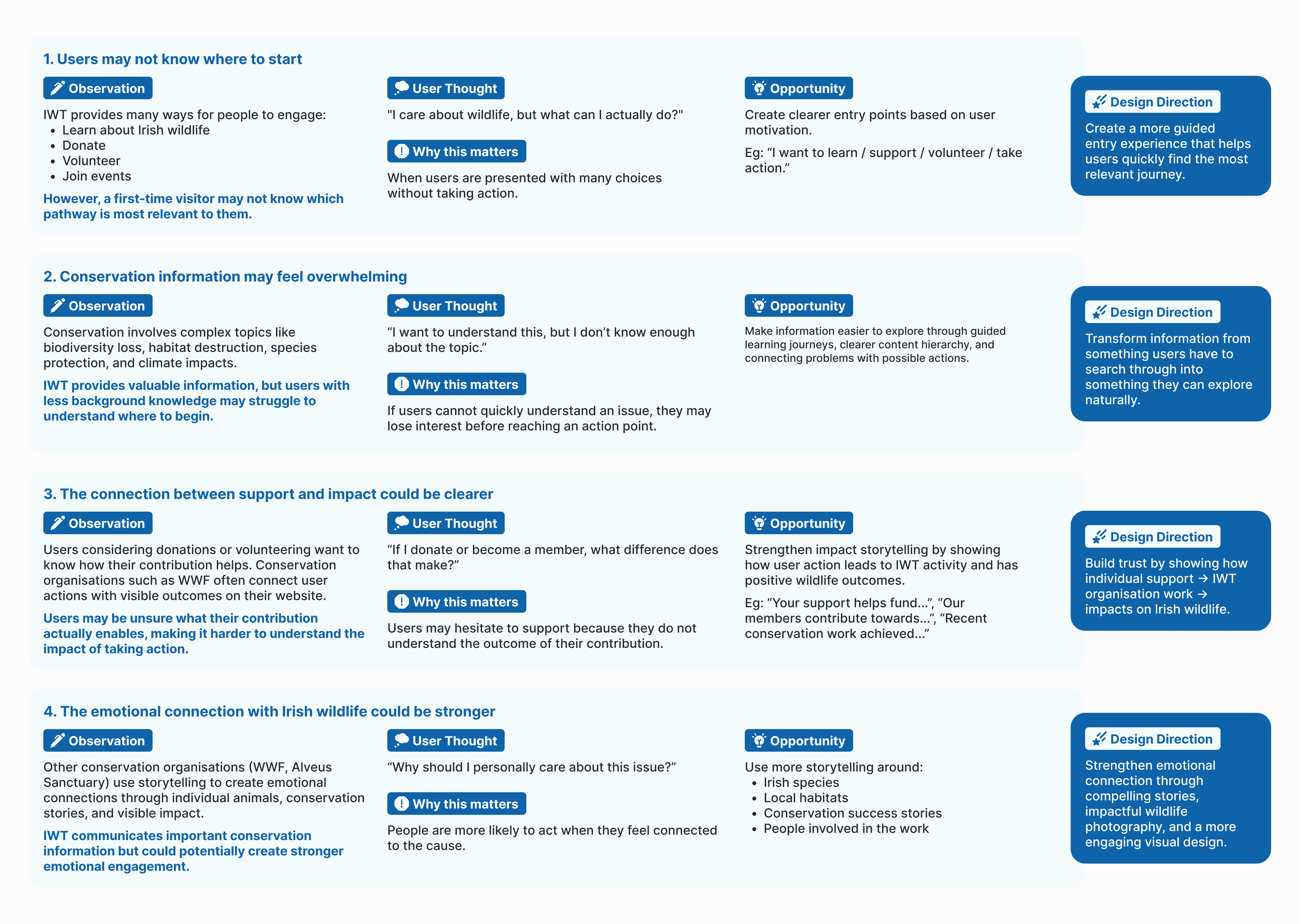
This shaped the direction of the redesign: how could I make the journey from “I care about Irish wildlife” to “I know what I can do about it” feel clearer, more personal and more motivating?
From findings to design direction
I started thinking about the site as a simple progression: Discover → Understand → Get involved
Someone might arrive because they are interested in a species or conservation issue. The site should then help them understand what is happening, what IWT is doing about it and where they can go next.

That meant the redesign needed to do a few things consistently:
Give important content enough context before asking visitors to act.
Make the connection between IWT’s work and its impact more visible.
Give different types of participation clear starting points.
Use the same visual and structural patterns across the key pages.
From structure to interface
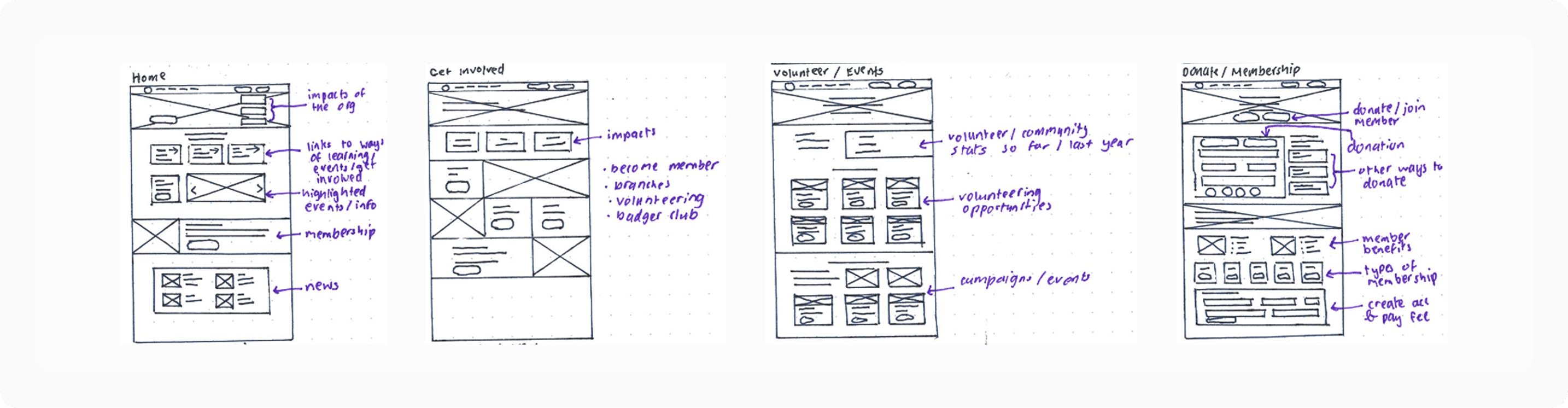
I took this into low and mid-fidelity wireframes before developing the final visual design.
At this stage, I was mainly working out what should come first, where actions belonged and how one section could lead into another. This was especially important on the homepage, where I wanted the order of information to feel deliberate rather than simply stacking content sections one after another.
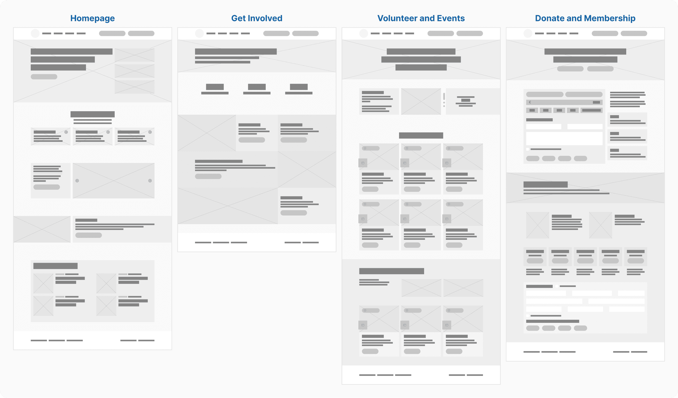
Once the structure was working, I moved into the visual design and reusable components.
Final Solution
Screen 1.
Homepage
Bringing IWT’s work and impact into the first visit
I structured the homepage around a simple flow: what IWT is working towards, why that work matters, and how visitors can get involved.
The page moves from the hero into an Impact section, using figures such as 90% of habitats still being in unfavourable condition to give context to the work before introducing the main actions.
I then brought volunteering, education, membership and getting involved together under How You Can Help. Each option includes a short explanation, rather than relying on a button label alone, so visitors can understand what sits behind each route.
For current campaigns, I used an autoplay carousel rather than giving one campaign a fixed space on the homepage. This means different pieces of current work can be featured without redesigning the page each time.
The rest of the page brings in membership, latest news, newsletter sign-up and social media, giving visitors ways to either act now or keep exploring IWT’s work.


Screen 2.
Get Involved
Giving each type of participation its own starting point
The Get Involved page brings the main ways of participating together rather than making visitors look for them across different parts of the site.
I used short descriptions alongside the cards so that each option has some context before someone clicks through. The page also introduces the scale of IWT’s existing community with figures such as 834 volunteers, 12 branches and €2.1 million raised.
The cards use wildlife imagery as well, bringing more of the subject matter into a page that could otherwise have become a simple directory of links.


Screen 3.
Donation
Showing where a donation goes
The Donation page starts by explaining why IWT needs support and what that support contributes towards. Instead of going straight into a payment form, visitors first see examples of where donations are used, including habitat protection, species conservation and community work.
I also added an embedded donation form, so the donation itself can happen without sending visitors to another page. Other methods, including iDonate, standing orders and cheques, are kept available underneath for people who prefer a different option.
The aim was to make the donation feel less like a standalone transaction and more connected to the work visitors had just been reading about.


Screen 4.
Volunteer & Events
Showing the different ways people can take part
Volunteering, events and webinars all give people different ways to engage with IWT, so I brought them into one page while keeping each section distinct.
An autoplay carousel highlights volunteer contributions, including the number of hours given to IWT’s conservation work. This makes the contribution of volunteers visible rather than only describing volunteering as an opportunity.
Volunteering opportunities and upcoming events use cards with the key information upfront. For webinars, I kept the cards more visual to make recent recordings easy to browse and link directly to the video.
At the bottom, newsletter sign-up and social links give visitors another way to stay connected if they are not ready to volunteer or attend something straight away.


Screen 5.
Membership
Showing what membership includes
The original membership experience relied heavily on links and form fields. I changed this so visitors could understand the membership options before reaching the form.
The page explains the benefits of joining and uses interactive membership cards to show the different options and prices. Hovering over the cards reveals Irish Wildlife magazine covers, giving visitors a preview of one of the benefits included with membership.
When a membership type is selected, that choice carries into the embedded membership form, so the visitor does not have to make the same decision again further down the page.


Creating a more consistent experience
The pages were designed as part of the same system rather than as separate screens.
I used shared patterns for cards, CTA treatments, typography hierarchy, spacing and content sections so that similar actions behaved in similar ways across the site.
The visual direction also brought more wildlife imagery into the interface. This gave the subject matter a more visible role while helping the redesigned pages feel like parts of the same site.

Reflection
This project changed what I pay attention to when redesigning a content-heavy website.
At the start, I was mostly thinking about how to make IWT look more engaging. Once I started working through the existing content, the harder questions were more basic: what needs to be seen first, what needs more explanation, and what should happen next?
I found that some of the biggest changes did not came from changing the relationship between existing content and actions. Putting impact before a donation, adding context to the different ways of getting involved, or connecting a membership choice directly to the form all came from thinking about what someone would need at that point in the journey.
The comparative review also influenced how I thought about the role of storytelling. WWF showed me the value of connecting an issue to its impact before asking people to act, while Alveus showed how individual animals and stories can make broader conservation topics easier to connect with.
The next step I would take would be to test whether those decisions actually come through to someone seeing the site for the first time. I would want to see whether people can find a way to get involved that feels relevant to them, and whether they understand what their support contributes to without needing it explained to them.