Irish Wildlife Trust
This project looks at the Irish Wildlife Trust website, with a focus on making IWT’s valuable work clearer and helping people understand how they can get involved.
The aim was to create a more connected journey from learning about conservation to finding a meaningful way to support Irish wildlife.
Duration
July - August 2026
Role
Solo UI/UX Designer
Wildlife is worth protecting, and the Irish Wildlife Trust already does a lot of work to bring awareness to conservation.
Their site aims to highlight Ireland’s wildlife and the issues affecting it, but I felt there was an opportunity to help the user follow through their journey in supporting the good cause.
If you have decided to get involved, it needs to be easy for you to know what IWT is doing and how you could contribute meaningfully.
That became the main idea behind this project: if someone cares enough to want to help, how can we support their journey to getting involved?
design system
Similar content behaved differently depending on where you found it. Get Involved used a text list, Reserves relied on basic links, Events showed everything at once, and News used shorter previews. Even calls to action shifted between labels like “Read more,” “Join today,” and the not-very-helpful “Click here.”
I pulled these recurring elements into a shared system: cards, calls to action, type styles, spacing, forms, impact figures, and selected states.
The aim wasn’t to make every page look identical. It was to give IWT a reliable set of building blocks that could flex around different content while still feeling connected. It also means future events, campaigns, and stories can be published without solving the same design problems from scratch.

01 / Homepage
The original homepage had all the right ingredients, but they didn’t quite add up to a clear story. Visitors could learn about IWT, see its work, or get involved, but the relationship between those things was easy to miss.
I reshaped the page around a more natural sequence: what IWT does, the difference it makes, and how someone can help. Impact figures appear earlier, photography does more of the storytelling, and each action comes with enough context to be useful, not just another button asking to be clicked.
scroll inside the screen to see more!


02 / get involved
This page already covered five ways to get involved, but the long text-heavy layout made them blur together.
I turned each route into a distinct card with a clearer title and description. I also brought in participation figures to show that these aren’t abstract calls to action; there’s already a real community taking part.
The goal wasn’t to reinvent the page. It was to make the choices easier to feel confident about.


03 / volunteer and events
The volunteering page worked when roles were available. When they weren’t, it more or less ended with "check back later." Meanwhile, the events page had the opposite issue: upcoming events and old events were all competing for attention in a long, never-ending list.
I added volunteer stories and other ways to stay connected, so an empty vacancy list no longer means a dead end. For events, I separated upcoming opportunities from past webinars and gave each listing a shorter, more consistent preview.
Both pages now stay useful even when the content changes (which, for a site like this, happens all the time).


04 / donation
The original page explained the different ways to donate, but not much about what that money would support. It felt more focused on the transaction than the reason behind it.
I added examples of the conservation work donations help fund before introducing the payment options. I also embedded the main donation form directly into the page, while keeping alternative methods nearby for people who need them.
It’s a small shift, but an important one: show people what their support can make possible, then make it straightforward to act.


05 / membership
Previously, visitors encountered the membership options before the benefits. They were being asked to choose a plan before there was much reason to care about one.
I moved the benefits higher up and used an interactive card to reveal IWT magazine covers (one of the more tangible membership perks). The membership options come afterwards, and selecting one carries that choice into the form automatically.
The journey now follows the way people are more likely to decide: see what membership offers, find the right option, and continue without having to make the same choice twice.
I followed the main routes into volunteering, events, donations and membership, paying attention to what visitors knew before they were asked to make a decision.


The same gaps kept appearing:
I did not have access to IWT’s analytics or users, so I treated these as design hypotheses rather than proven usability findings.
I looked at a couple other organisations to see their user journey.
WWF often explains an issue, shows what is being done and then offers a way to help. The action feels like a continuation of the content rather than a separate request.
Alveus Sanctuary uses individual animal stories as a way into wider conservation topics. Telling the story behind their work gives people something grounded to connect with, rather than asking them to care about conservation as an abstract idea.
Both made the journey towards supporting wildlife feel more deliberate. That became the opportunity for IWT: make their work feel more tangible through stronger visual storytelling, more context behind an action and clearer evidence of impact, so users can move naturally from understanding the issue to supporting it.
PERSONA
Sadhbh already cares about Irish wildlife, and she doesn’t need convincing that it matters. What she needs is a clearer sense of what IWT has already done, and how she can have a role in that.
When that picture is easier to see, supporting IWT feels less like a vague next step and more like a meaningful way to take part in protecting Irish nature.

design direction
From my identified gaps and Sadbh's profile, I pulled out a set of design directions to guide the redesign.
WIREFRAMES AND PROTOTYPES
I used low- and mid-fidelity wireframes to work through the order of the content. Evidence of impact moved closer to calls to action. Ways of helping were grouped together. Membership options appeared before the form, and the chosen option carried into it.

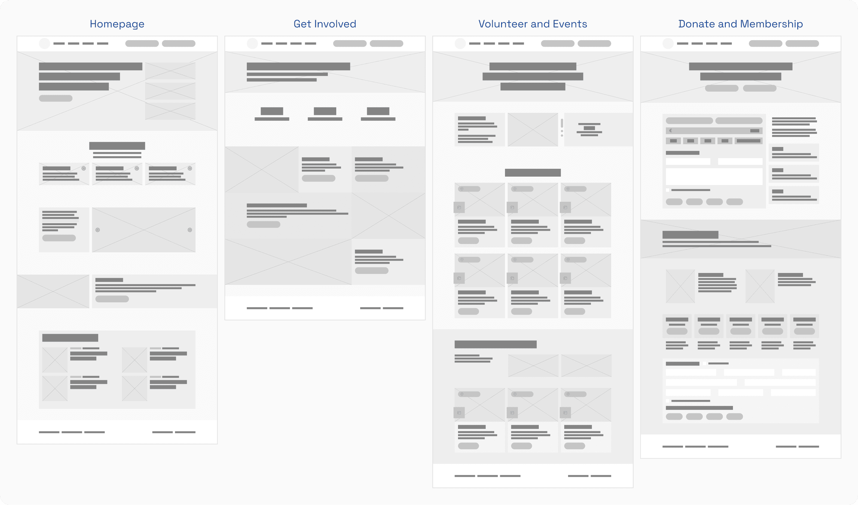
Working without the finished visual style made it easier to concentrate on those relationships. Once the sequence made sense, I moved into the final interface and reusable components.
REFLECTION
I went into the project expecting to spend most of my time on how the website looked. Instead, I spent a lot of it moving things around, cutting things back and working out what was important to people wanting to support the animals and our world.
This project reminded me that improving a page does not always mean adding more. Sometimes, simply changing when information appears can make a decision much easier. Not the most glamorous lesson, but probably the most useful one.
As this was a self-led project, the next step would be testing it with people unfamiliar with IWT and seeing where my decisions hold up. I would pay particular attention to hesitation, wrong turns and whether the relationship between the impact and the action feels as clear to visitors.